
The Best Wall Art for Home Office Focus: Your Complete Guide to Creating a Productive Workspace
You know that feeling when you sit down at your home office desk, ready to tackle your to-do list, and instead find yourself staring at the wall, wondering why you can’t seem to concentrate? Turns out, what you’re looking at might be part of the problem.
Finding the best home office wall art isn’t just about making your workspace look pretty, though that’s definitely a bonus. It’s about creating an environment that actively supports your brain’s ability to focus, think clearly, and actually get work done. And yes, there’s legitimate science behind this that goes way beyond interior design trends.
Let me walk you through everything I’ve learned about choosing wall art that doesn’t just sit there looking nice, but actively helps you work better. Because after working from home for years and making pretty much every mistake possible with workspace design, I’ve figured out what actually makes a difference.
Why Your Wall Art Actually Matters
Before we dive into specific recommendations, let’s talk about why this even matters. Research highlighted in The Guardian shows that well-chosen wall art can increase workplace productivity by up to 15%. That’s not a small number. For someone working 40 hours a week, we’re talking about an extra six hours of productive time just from making better decisions about what hangs on your walls.
But here’s the thing that really changed how I think about this: your brain is constantly processing everything in your visual field, whether you’re consciously aware of it or not. Studies from Princeton University using MRI scans have shown that clutter and visual chaos compete for neural representation in your visual cortex. They call it “visual noise,” and it reduces focus, increases cognitive overload, and impairs working memory.
In plain English? When your workspace has too much going on visually, your brain is working overtime just to filter out the irrelevant stuff, leaving less mental energy for the actual work you’re trying to do. The right wall art can either add to that noise or help quiet it down. That’s the difference we’re aiming for here.
Office Wall Art: Understanding What Works and Why
Let’s start with the fundamental question: what types of art actually support focus rather than distract from it?
The Nature Connection
Here’s something that consistently shows up in the research and, honestly, matches my personal experience perfectly. Nature themed prints and imagery consistently top the list for working spaces. Dr. Ree Langham, a psychologist specializing in workplace wellness, explains that images of nature such as water, hills, and plants help us feel more grounded and calm. They reduce stress and anxiety while helping us maintain focus.
The reason goes deeper than just “nature is pretty.” Research on biophilic design shows that even images of natural elements can activate something called the parasympathetic nervous system, which is your body’s natural relaxation and recovery mode. When you’re in this state, your cognitive function actually improves. You think more clearly, make better decisions, and sustain attention for longer periods.
I have a simple landscape print of misty hills above my desk in soft blue green tones, and I’ve noticed that glancing at it during intense work sessions genuinely helps. It’s like giving my brain a two second mini vacation that resets my focus. Sounds almost too simple to be true, but the science backs it up.
The Minimalist Advantage
The second major category that consistently comes up as beneficial for focus is minimalist or abstract art with clean lines and limited colors. This is where the cognitive load research becomes really interesting.
Studies on minimalism and cognitive function show that reducing visual complexity creates space for our minds to breathe, think, and create with renewed vigor. When unnecessary visual noise is removed, our minds can dedicate more resources to meaningful tasks, leading to improved decision-making and creative problem-solving.
Here’s the key distinction, though. Minimalist doesn’t mean boring or sterile. It means intentional. A well-chosen abstract piece with a few flowing lines in calming colors can be visually interesting while still keeping your cognitive load low. The opposite would be a highly detailed, busy pattern that forces your brain to constantly process complex visual information even when you’re not directly looking at it.
Think of it this way: your brain is like a computer with limited RAM. Everything in your visual field takes up some of that processing power. Minimalist art uses very little of it, leaving more available for your actual work. Busy, complex art uses a lot of it, even when you’re not consciously paying attention to it.
Home Office Wall Art: Color Psychology That Actually Works
Okay, let’s talk about colors, because this is where things get both scientific and practical at the same time.
Blues: The Focus Enhancer
Blue is pretty much the gold standard for focus enhancing art. Research on color psychology in workspaces shows that blue stimulates the mind and helps increase productivity and focus, particularly if you work on repetitive tasks. There’s a reason companies like Facebook and Twitter use blue in their branding. It keeps your brain engaged without overstimulating you.
Lighter blues create a sense of calm and openness, which is perfect for contemplative work or tasks requiring sustained concentration. Darker blues convey strength and reliability, making them suitable for more professional settings or when you need to feel grounded and focused.
I’ve found that soft, sky blue tones work incredibly well for my morning work sessions when I need to ease into focus mode. It’s calming without being sleepy.
Greens: The Natural Balance
Green is all about balance and calm. According to workspace design research, green is known to reduce eye strain, which is incredibly valuable if you spend hours staring at screens. It can help relax you both mentally and physically, and even alleviate feelings of anxiety.
The reason green works so well ties back to our evolutionary history. For millions of years, green meant vegetation, food, water sources, safety. Our brains are literally wired to respond positively to it. When you see green, your nervous system unconsciously registers: this is a good place to be.
Sage greens, muted forest tones, and soft moss colors are particularly effective for home office settings. They’re calming without being sedating, and they provide that connection to nature without being overly literal about it.
What to Avoid: The Overstimulation Problem
Now let’s talk about what doesn’t work as well for focus. Bright reds and vibrant yellows can be tricky. Color psychology experts note that while red has an inherent sense of urgency and can boost energy, it’s generally not the best choice for spaces where you need sustained focus. It can feel too demanding, too activating.
Yellow is interesting. It can boost happiness and even creativity in small doses. But too much yellow can strain your eyes and become distracting. If you love yellow, use it as a small accent, not the dominant color in your office wall art.
The key principle here: you want colors that support sustained attention, not colors that constantly grab it. Save the bold, energizing colors for other rooms where you want activation rather than concentration.
Focus Wall Art: Getting the Design Elements Right
Let’s get practical about what actually makes a piece of art good for focus. It’s not just about the subject or the colors, it’s also about composition, complexity, and placement.
The Power of Single Focal Points
Here’s something I learned the hard way after trying to create an “inspiring” gallery wall that ended up just making me feel scattered. Design experts consistently recommend that one strong focal piece above your desk often works better for focus than a busy gallery wall.
The reason? Your brain likes having a clear resting point. When you look up from your work, your eyes naturally want somewhere definite to land. One cohesive piece gives your brain that anchor. Multiple pieces, especially if they’re not carefully coordinated, create more decisions for your visual system to process: Where should I look first? How do these relate? What’s the hierarchy?
That processing happens unconsciously, but it still uses mental energy. For a gallery wall in your living room? Sure, that complexity can be interesting and energizing. For the wall you’re staring at while trying to concentrate? Less is definitely more.
Keeping Compositions Uncluttered
This ties directly into the research on visual clutter and cognitive load. Visual complexity in your immediate environment forces your brain to process more information, which taxes your working memory and reduces your ability to concentrate on complex tasks.
What does this mean for choosing art? Avoid highly detailed, chaotic, or very busy patterns near your primary work area. A photograph with hundreds of tiny details, a pattern with complex repeating elements, or an abstract piece with dozens of competing visual elements will all add to your cognitive load.
Instead, look for:
- Clean, simple compositions
- Limited color palettes (three to five colors maximum)
- Clear, defined shapes rather than visual chaos
- Sufficient negative space (empty areas in the composition)
- Cohesive visual flow rather than competing elements
Think “calming” and “ordered” rather than “exciting” and “complex.”
Size and Placement Matter
Here’s the practical stuff that makes a real difference in your day to day experience. Workspace design recommendations suggest hanging art at eye level, either directly in front of you or slightly off to the side, so you can rest your gaze on something calm during breaks.
For the space directly above your desk, you typically want one medium to large piece rather than multiple small ones. A good rule of thumb: the art should take up about two thirds the width of your desk. Too small and it gets lost. Too large and it can feel overwhelming.
If you have side walls in your office, that’s where you can add variety with one or two complementary pieces. Botanical prints, simple line art, or additional minimalist pieces can add interest to your peripheral vision without creating distraction.
Wall Art to Focus: Making the Right Choice for Your Work Style
Not everyone works the same way, and that means the “best” art for your home office might be different from what works for someone else. Let’s break this down by work type.
For Deep Work and Analysis
If your job involves complex problem solving, data analysis, programming, writing, or any task requiring sustained, intense focus, you want art that’s maximally calming and minimally distracting.
Best choices:
- Monochromatic or very limited color palettes
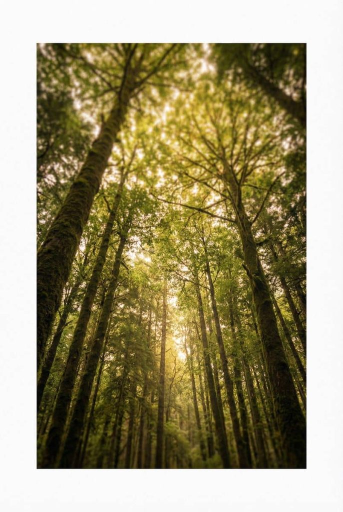
- Simple landscape photography (misty mountains, calm water, open sky)
- Minimalist abstracts with gentle, flowing lines
- Solid color fields with minimal variation
These provide that visual resting point without introducing complexity that your already-taxed brain has to process.
For Creative and Brainstorming Work
If your work involves creative thinking, ideation, design, or problem solving that benefits from divergent thinking, you can handle slightly more visual interest.
Best choices:
- Abstract art with interesting but not chaotic compositions
- Nature scenes with more elements (forest paths, interesting cloud formations)
- Gentle geometric patterns
- Art with inspiring but not overwhelming color combinations
The key here is finding art that feels stimulating in a good way, opening up mental pathways without overwhelming your visual processing.
For Mixed Work Styles
Most of us do a combination of focused analytical work and creative thinking. If that’s you, aim for the middle ground: art that’s interesting enough to be inspiring but simple enough to not interfere with concentration.
Best choices:
- Soft color landscape photography
- Simple botanical or floral prints
- Minimalist art with a few carefully chosen colors
- Abstract pieces with clear, defined forms
The Typography Question
Let’s address motivational quotes and typography art, because opinions are pretty divided on this. Design experts note that motivational prints can boost mental wellbeing and productivity throughout the day, but there’s a catch.
The key is keeping it minimal. A single word or very brief phrase in clean typography can serve as a useful anchor or reminder. But here’s what I’ve learned: if you find yourself reading the quote every time you look at it, it’s probably too complex or too interesting, which means it’s actually distracting you rather than supporting you.
Also, be honest with yourself about whether motivational messaging actually helps you or just adds subtle pressure. If you tend to feel tense or overstimulated while working, experts recommend prioritizing soothing nature or minimalist art over loud motivational posters.
For me personally, I had a motivational quote print for about three months before realizing that I was unconsciously tensing up every time I read it. It was supposedly inspiring, but it actually added stress. I replaced it with a simple photograph of a calm lake, and immediately felt the difference. Your mileage may vary, but pay attention to how you actually feel, not how you think you should feel.
Best Wall Art: A Room-by-Room Approach
Let me give you some specific, actionable recommendations based on different office setups and needs.
Above Your Desk: The Primary Focus Area
This is prime real estate. Whatever you put here, you’ll be looking at it a lot, so make it count.
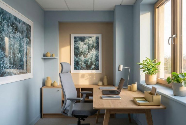
Ideal choice: One medium to large minimalist landscape in soft blues or greens. Think coastal scenes, misty forests, rolling hills, or abstract representations of natural elements.
Size guide: For a 60 inch desk, aim for a piece that’s 36 to 40 inches wide. For a smaller desk (48 inches), go with 28 to 32 inches wide.
What to avoid: Busy patterns, high contrast imagery, very dark or very bright colors, anything with a lot of small details.
Side Walls: The Secondary Interest
These walls are in your peripheral vision, so they can handle slightly more visual interest without being distracting.
Ideal choice: A pair of simple botanical prints, line art drawings, or coordinated minimalist pieces. The key word here is “pair.” Two similar pieces create a sense of order. An odd assortment creates visual questions.
Placement: Hang them at eye level when you’re seated, with about 2 to 4 inches of space between them if you’re doing a diptych arrangement.
What to avoid: Anything that’s drastically different in style from your main piece. You want cohesion, not conflict.
Behind You (On Camera): The Professional Backdrop
If you do video calls, this matters more than you might think. Professional design advice suggests that your backdrop should look polished and professional while remaining calm and undistracting.
Ideal choice: A tidy, balanced piece in muted colors. Think soft abstracts with blue green tones, simple landscape photography, or minimalist geometric designs.
What to avoid: Anything too personal (family photos work in your living room, less so in professional video calls), anything too bold or distracting, or anything that might be culturally or politically sensitive.
Pro tip: Test how it looks on camera before committing. Colors can look different on video, and what seems calm in person might read as distracting on screen.
Comparing Your Options: What Works Best for Different Needs
Let me break down the main categories of art in a way that makes the comparison clear:
| Art Type | Focus Support | Visual Interest | Cognitive Load | Best For | Avoid If |
|---|---|---|---|---|---|
| Nature Landscapes (Calm) | Excellent | Moderate | Very Low | Deep work, analysis, sustained concentration | You need energizing rather than calming |
| Minimalist Abstract | Excellent | Low to Moderate | Very Low | Any focus work, all day concentration | You find minimalism boring or cold |
| Botanical Prints | Very Good | Moderate | Low | Mixed work styles, creative and analytical | You prefer non-literal imagery |
| Geometric Patterns (Simple) | Good | Moderate to High | Low to Moderate | Creative work, design tasks | Complex analytical work |
| Abstract (Complex) | Fair | High | Moderate | Creative brainstorming, inspiration | Sustained analytical focus |
| Motivational Typography | Variable | Low to Moderate | Low to Moderate | Goal-oriented work, short bursts | You find it adds pressure |
| Photography (Detailed) | Fair to Poor | High | Moderate to High | Short work sessions only | All day concentration |
| Bold, Bright Art | Poor | Very High | High | Energy bursts, not concentration | Any sustained focus work |
A few notes on reading this table. “Focus Support” refers to how well the art style actively supports sustained concentration. “Visual Interest” is about how engaging the piece is to look at, which can be a double edged sword. “Cognitive Load” indicates how much unconscious mental processing the art requires, even when you’re not directly looking at it.
The sweet spot for most home office settings is high focus support, moderate visual interest, and low cognitive load. That usually means nature landscapes or minimalist abstract pieces.
Real World Application: My Recommendations
Let me give you some specific scenarios and recommendations based on different situations.
Scenario 1: You work 8 hours a day in your home office, doing primarily analytical work
Go with one large (30 to 40 inches wide) landscape photograph or painting in soft blue green tones. Position it directly above your desk at eye level. Keep it simple: think misty coastlines, gentle rolling hills, or a forest scene with good depth but not too much detail. Add nothing else to that wall. Your brain will thank you.
Scenario 2: You do creative work and need inspiration
Choose one to three pieces that have more visual interest but still maintain overall simplicity. Consider abstract art with interesting forms and colors, but avoid pieces that are visually chaotic. You want something that opens up thinking, not something that creates mental clutter. Nature scenes with more interesting elements, like a forest path with dappled light or interesting cloud formations, can work well here.
Scenario 3: You share your home office with family
This is trickier because you need to balance different needs and preferences. Interior design experts suggest choosing nature inspired themes that have broad appeal and creating clear, dedicated work zones. One approach: let each person choose art for their specific work area, but keep a cohesive color palette throughout the room so it doesn’t feel visually fragmented.
Scenario 4: You have a very small home office or a desk in a corner
With limited space, one well chosen piece becomes even more important. Go with a medium sized piece (20 to 30 inches) in calming colors. Because the space is small, avoid anything that feels heavy or dark, which can make the area feel even more cramped. Lighter blues, soft greens, or white-heavy minimalist pieces work well.
Scenario 5: Your office has virtually no natural light
Research on workspace design shows that natural light is crucial for productivity and wellbeing. If you can’t change your lighting situation, choose art that feels light and airy. Avoid dark or heavy pieces that will make the space feel even more cave-like. Look for images that suggest light: sunrise scenes, misty morning landscapes, or light-colored abstracts.
The Practical Details That Matter
Let’s talk about some practical considerations that people often overlook but that make a real difference in how well your art choices work.
Framed vs. Unframed
Design guidance suggests that framed art tends to give a more traditional, formal look, while unframed canvases or prints contribute to a more contemporary, relaxed vibe. For home offices, framed pieces often work better because they create clear boundaries and look more finished and professional, especially if you’re on video calls.
If you’re going with framed art, keep the frames simple. Ornate, busy frames add visual complexity that works against your focus goals. Simple wood frames, thin metal frames, or minimalist black or white frames usually work best.
Arrangement Principles
If you’re hanging multiple pieces, follow the rule of thirds. In a small office, use one to three coordinated pieces maximum. Visual design research shows that too many mismatched artworks increase visual load and can subtly reduce focus.
When hanging two pieces side by side, keep them close together (2 to 4 inches apart) so your brain reads them as one unit rather than two separate elements competing for attention.
For vertical arrangements, maintain consistent spacing and ensure the pieces are actually part of a cohesive set, not just random pieces you happened to have.
Testing Before Committing
Here’s something I wish I’d known earlier: live with an image for a while before you buy the expensive print. Many art retailers let you download high resolution images. Set one as your desktop background for a week and notice how you feel. Does it calm you? Distract you? Make you feel more or less focused?
This simple test has saved me from several expensive mistakes. What looked perfect in an online gallery sometimes felt all wrong when I actually had to look at it eight hours a day.
When to Break the Rules
Now that I’ve given you all these guidelines, let me tell you when it’s okay to ignore them: when you’ve found a piece that genuinely moves you and makes you happy to be in your workspace.
Psychological research on workspace design shows that when people are able to pick and choose the artwork and images that surround them, they’re more productive and generally happier at work. The agency and personal connection matter.
So if you absolutely love a piece that’s technically not ideal for focus, like a colorful abstract that’s more complex than recommended, but it brings you genuine joy? Go for it. You’ll probably find that the positive emotional association outweighs the slight increase in cognitive load.
The guidelines I’ve shared are based on research about what works for most people most of the time. But you’re not “most people.” You’re you, with your own aesthetic preferences, emotional associations, and ways of working. Use the science as a starting point, but let your personal response be the deciding factor.
That said, if you try something for a few weeks and notice you’re having trouble focusing, feeling more stressed, or just not working as well as you’d like, come back to these principles. Sometimes what we think we want isn’t actually what serves us best.
Putting It All Together
Let me wrap this up with a simple framework you can use when shopping for home office art:
Start with the basics: Look for pieces with calming colors (blues, greens, neutrals), simple compositions (minimal visual complexity), and nature themes or abstract minimalism.
Consider your work style: If you do primarily analytical work, err on the side of simpler. If you do creative work, you can handle a bit more visual interest.
Think about size and placement: One strong focal piece beats multiple competing elements. Place it where your eyes naturally land when you look up from work.
Test your response: Before committing to expensive pieces, live with images for a while and notice how they actually make you feel.
Remember the goal: You’re not decorating a gallery. You’re creating a workspace that actively supports your ability to think, focus, and do your best work.
The right wall art for your home office is the piece that you barely notice when you’re deep in flow state, but that subtly supports that flow by keeping your environment calm, ordered, and psychologically comfortable. It’s the piece that gives your eyes and mind a gentle resting place during breaks, then allows you to return to work feeling refreshed rather than distracted.
Take your time with this decision. Look at options. Notice what actually makes you feel focused and calm, not just what looks impressive or on trend. Your future productive self will thank you for the effort.
Your workspace is where you spend a huge portion of your life. Making it a place that actively supports your best work isn’t frivolous, it’s an investment in your productivity, your wellbeing, and your success. And sometimes, that investment starts with something as simple as choosing the right image to put on your wall. Find more about our original amazing wellness art.