Elevate Your Clinic with medical office wall art: A Browse-Worthy Guide
Walk into most medical clinics, and you’ll see the walls are often an afterthought. Sterile, blank, and maybe a little intimidating. But what if those walls could do more than just hold up the ceiling? What if they could actively help your patients feel calmer and more at ease?
The truth is, the right art isn't just decoration; it's a strategic tool for better patient care. It has the power to transform a clinical space from one that triggers anxiety to one that fosters comfort and healing from the very moment someone walks in. This positive takeaway is simple: thoughtful art makes patients feel cared for even before they see a doctor.
Why Your Wall Art Is a Critical Part of Patient Care
Let’s be honest: a visit to the doctor can be stressful. The environment can either crank that stress up or dial it down. Empty, impersonal walls often make a space feel cold, which only amplifies a patient's unease. On the other hand, thoughtful, engaging art provides a welcome and positive distraction.
This isn’t just a hunch; it’s a core principle of evidence-based design. The days of intimidating, sterile clinics are fading fast as more practices recognize that the physical environment directly impacts patient wellness. A positive insight here is that investing in the patient environment signals a deep commitment to their overall well-being.
The Power of Positive Distraction
Imagine a patient in your waiting room, nervously anticipating their appointment. Instead of staring at a blank wall and letting their anxiety build, their eyes land on a large, serene photograph of a forest path.
That simple act of focusing on a calming image can genuinely help lower their heart rate and quiet their mind. This concept, known as positive distraction, is a cornerstone of modern healthcare design. Art gives patients a gentle focal point, helping them disengage from their worries and the clinical nature of their surroundings.
Key Insight: Wall art isn't a passive element in a medical office. It is an active component that can lower perceived wait times, reduce stress, and fundamentally improve the patient's entire experience with your practice.
This effect isn't limited to the waiting room, either. In an exam or treatment room, a beautiful landscape print offers a calming focal point during a procedure. It’s a small detail, but it communicates a powerful message: we care about your comfort.
Evidence-Informed Design in Practice
The shift toward patient-centered care has sparked real investment in creating better healthcare environments. In fact, North America is leading the charge with a 43.60% market share in the healthcare wall decor space, largely driven by facilities embracing biophilic, or nature-inspired, designs.
The data shows why this is a smart investment.
- Research has found that nature scenes can lower patient anxiety by up to 37% in waiting areas.
- A 2023 survey revealed that 68% of healthcare managers believe these aesthetic upgrades directly boost patient satisfaction scores by 15-20%.
These aren't just vanity metrics. This investment delivers tangible returns by reducing patient stress, improving satisfaction scores, and even boosting staff morale by creating a more pleasant place to work.
When you intentionally select art that is calming and positive, you’re making a direct investment in the well-being of every single person who walks through your doors. If you're looking for more ideas on this, you might be interested in our guide on how to use nature art for stress relief. This isn't just decorating—it's designing for healing.
Using Color Psychology to Shape Patient Experience
Color speaks a language all its own, subtly influencing our emotions and perceptions without us even noticing. In a healthcare setting, this effect is magnified. The right color palette in your medical office wall art can genuinely transform a space from clinical and sterile to warm and reassuring.
This isn't about just picking colors you happen to like; it's about making deliberate, evidence-informed choices to foster specific feelings. Let's move beyond theory and look at how this actually works on the walls of your clinic.
Curating Colors for Clinical Zones
Different areas of your practice serve very different functions, and the color scheme of your art should reflect that. A waiting room where you want to lower anxiety has completely different needs than a physical therapy space where you want to inspire motivation.
Here’s a practical breakdown of how this works:
- Waiting and Reception Areas: The goal here is pure tranquility. Art dominated by soft blues and greens creates a serene atmosphere, helping to dial down patient anxiety from the moment they walk in the door. For example, a large print of a calm lake at dawn.
- Consultation and Exam Rooms: In these one-on-one spaces, the aim is to foster trust and clear communication. A mix of neutral tones with gentle greens or muted blues in your art can promote a sense of calm focus. A practical example is a series of botanical prints with soft, earthy backgrounds.
- Procedure or Treatment Rooms: This is where anxiety might be at its peak. Distracting and soothing art is your best tool. Scenes with deep, calming blues or expansive, peaceful landscapes can provide a much-needed mental escape.
- Physical Therapy and Rehab Areas: Optimism and energy are the name of the game here. Art featuring gentle yellows, soft oranges, or bright, sunlit nature scenes can inspire motivation and a more positive outlook on the work ahead.
By strategically curating colors zone by zone, you guide the patient's emotional journey through your facility. Your art becomes a subtle but constant source of comfort and support.
This concept map really drives home the direct benefits of creating a healing environment through these thoughtful art choices.
As you can see, the dots clearly connect between a healing environment, reduced patient anxiety, and improved overall satisfaction—all outcomes directly influenced by your art selection.
Color Psychology for Medical Spaces
To make these choices easier, I've put together a quick-reference table. Think of it as a cheat sheet for matching color psychology to the specific needs of different areas within your practice.
| Color Palette | Psychological Effect | Ideal Placement | Practical Example |
|---|---|---|---|
| Blues & Greens | Calming, Serene, Trustworthy | Waiting Rooms, Consultation Rooms, High-Stress Areas | A panoramic photo of a misty forest or a quiet coastline. |
| Yellows & Oranges | Uplifting, Optimistic, Energizing | Physical Therapy/Rehab, Pediatric Areas, Staff Lounges | Artwork featuring sunflowers or a bright sunrise over a field. |
| Neutrals & Earth Tones | Grounding, Secure, Focused | Exam Rooms, Offices, Hallways | A series of prints showcasing smooth river stones or desert sands. |
| Purples & Lavenders | Soothing, Contemplative, Spiritual | Quiet/Meditation Rooms, Palliative Care, Chapel | Images of lavender fields at dusk or soft, hazy mountain horizons. |
This table provides a solid starting point, helping you align your art procurement with a clear, evidence-based strategy for enhancing the patient experience.
The Science of Soothing Hues
The link between color and mood isn’t just a feeling; it’s backed by compelling evidence. For medical practices, this data is incredibly valuable. Studies have shown that viewing art with prominent blues and greens can reduce stress hormones by up to 25%.
This is why collections featuring calm waters or lush forests are such a consistently good fit for waiting rooms and other high-anxiety zones. It’s not just about aesthetics; it’s a clinical decision that directly impacts the physiological well-being of your patients.
Key Insight: By selecting art with calming color palettes, you are actively triggering a biological response that reduces stress. You’re turning your walls into a functional tool that helps patients feel more at ease, both physically and mentally.
A Practical Example: Putting It All Together
Let’s imagine you’re outfitting a new family practice.
In the main waiting room, you might hang a large triptych of a calm ocean scene. The expansive, serene blues and gentle sense of motion would immediately set a peaceful tone.
For the pediatric exam rooms, you could switch to pieces from a collection of cheerful, brightly-colored animal portraits. The warm, sunny yellows and bright imagery provide a friendly, non-intimidating atmosphere for younger patients and their parents.
Meanwhile, for the staff break room, a vibrant piece featuring a sunlit forest could help rejuvenate your team during their much-needed downtime. For more ideas, our post on the best colors for office wall art offers additional guidance.
This zoned approach ensures that every piece of art serves a specific purpose, contributing to a cohesive and genuinely healing environment for every single person who walks through your doors.
Bringing Nature Indoors with Biophilic Design
We all have a deep, instinctual connection to the natural world. It’s a powerful resource for healing, and it forms the very foundation of biophilic design—a practice focused on weaving natural elements and patterns into the spaces we build. When we talk about medical office wall art, this isn’t just about hanging a few pretty pictures. It’s about deliberately using nature imagery to create a genuinely restorative atmosphere.
The science behind this is pretty fascinating. Simply looking at scenes of nature, even just in a photograph, can kick off a physiological response that measurably reduces stress, lowers blood pressure, and fosters a sense of calm. This makes biophilic art one of the most effective tools you have for improving the patient experience.
Why Nature Art Works So Well
When a patient is anxious, their world shrinks. Their focus narrows, and they become hyper-aware of every uncomfortable sensation and the cold, clinical surroundings. Nature art offers an effortless, positive escape route, gently pulling their attention away from their worries.
An image of calm waters or a sun-dappled forest doesn’t require any mental work. Unlike abstract art, which can sometimes be confusing or even unsettling in a high-stress environment, natural landscapes are universally understood and soothing. They tap into a primal sense of peace and safety we all share.
This isn’t just a nice idea; it’s backed by evidence. Multiple studies have shown that patients in rooms with views of nature or nature-themed art report less pain, require less pain medication, and even have shorter hospital stays. A positive takeaway is that nature art is a low-cost, high-impact tool for compassionate care.
Turning Clinical Spaces into Calming Journeys
Applying biophilic design with your wall art can radically shift the entire feel of your facility. Instead of sterile corridors and intimidating exam rooms, you can craft spaces that feel more like a gentle escape.
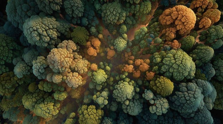
- Transform Long Hallways: A long, featureless corridor can feel like a grim march. But installing a large-scale mural of a forest path, like the one pictured above, turns that walk into a peaceful journey. It provides visual interest and a symbolic sense of moving forward through a calming landscape.
- Create Focal Points in Treatment Rooms: In a space where a patient feels vulnerable, a single, captivating piece of art can make all the difference. Imagine a series of serene ocean prints above an exam table—it gives the patient a specific, calming image to focus on during a procedure, acting as a visual anchor.
- Soften High-Tech Areas: Diagnostic areas packed with machinery are often the most intimidating. A gallery wall of vibrant botanical prints or images of lush greenery can soften the hard edges of technology, making the entire experience feel less overwhelming.
Expert Tip: When choosing nature art, look for pieces that feel expansive and offer a sense of depth. Images with a clear foreground, middle ground, and background—like a path leading into a forest or a view across a lake to distant mountains—are especially effective. They draw the viewer in and create a more immersive, calming experience.
When you start implementing these ideas, your medical office wall art stops being simple decoration and becomes a fundamental part of the healing process.
Choosing Genuinely Restorative Nature Art
It’s important to remember that not all nature art is created equal. The goal is to select images that feel open, safe, and deeply serene.
Here are a few practical tips I’ve learned for making the right choice:
- Prioritize Water and Greenery: Art featuring calm bodies of water (think lakes, slow-moving rivers, or tranquil seascapes) and lush, green foliage consistently tests as the most restorative. These images evoke powerful feelings of life, peace, and abundance.
- Avoid Unsettling Imagery: This one is critical. Steer clear of any images that could be interpreted negatively. That means no stormy skies, turbulent water, barren landscapes, or predators. While these can be dramatic, they might inadvertently dial up a patient’s anxiety.
- Consider Local Landscapes: If your practice is near a well-known natural landmark—a specific coastline, mountain range, or forest—incorporating local imagery can create a powerful sense of connection and familiarity. It makes the art feel personal and grounded in the community you serve.
This approach ensures your art choices aren’t just beautiful but are also therapeutically effective. If you’re curious about the principles behind these ideas, you can learn more about the essentials of biophilic design in our dedicated article. Ultimately, bringing nature indoors is a simple yet profound way to show patients you care about their holistic well-being.
Strategic Art Placement for Maximum Positive Impact
Picking the right medical office wall art is a fantastic start, but it’s only half the journey. Where and how you hang each piece is what truly determines whether it becomes a calming influence or just background noise. I’ve seen it countless times: a beautiful, thoughtfully chosen piece of art has almost no effect simply because it was placed incorrectly.
This isn’t about just filling blank walls. Think of it as a form of non-verbal communication with your patients. You’re choreographing their experience, guiding their eye from one reassuring moment to the next. When you get placement right, the positive insight is clear: every detail of the patient experience has been considered.
The Seated Eye-Level Rule
One of the most common mistakes I see in healthcare settings is hanging art way too high. In a gallery or a retail store, art is hung for a standing viewer. But in your waiting room or consultation space, your patients are almost always sitting down.
The fix is simple but critical: hang your art at a seated eye-level. The center point of the artwork should be roughly 52 to 54 inches from the floor. This small adjustment makes a huge difference. The art feels more personal and accessible, inviting patients to actually engage with it instead of having to crane their necks.
This principle is absolutely essential in:
- Waiting Rooms: Center your main pieces on walls where seated patients will naturally be looking.
- Consultation Rooms: Place art directly in the patient’s line of sight from their chair. It gives them a calming focal point during what can be stressful conversations.
- Infusion or Dialysis Centers: Here, patients are often reclined, so art needs to be clearly visible from beds and treatment chairs.
Scale Art to the Room, Not Just the Wall
Next, let’s talk about scale. A tiny print on a massive wall feels lost and insignificant, while a huge, overpowering piece can make a small room feel claustrophobic. Your goal is to find a sense of balance and proportion that feels right for the space.
A good rule of thumb is that your art should take up about two-thirds to three-quarters of the available wall space, especially when hung over a piece of furniture like a sofa or a long bench.
Practical Example: Let’s say you have a 9-foot-long sofa in your reception area. The artwork (or a grouping of several pieces) hanging above it should span somewhere between 6 and 7.5 feet wide. This anchors the furniture and the art together, creating a cohesive visual unit that makes the whole area feel grounded and purposefully designed.
For those long, empty hallways that are so common in clinics, a series of medium-sized, thematically related prints often works much better than one single large piece. It creates a pleasing rhythm and a sense of discovery as people move through the space.
Placement for Patient Comfort and Safety
In any healthcare environment, placement isn’t just about aesthetics; it’s also about patient safety, accessibility, and comfort. You have to think about how people will physically move through and interact with the space.
This means making sure your medical office wall art never obstructs movement or creates a potential hazard. Always keep art clear of doorways and high-traffic corners where it could easily be bumped or snagged.
For clinics that serve specific populations, these considerations become even more vital:
- Pediatric Clinics: Art needs to be installed with secure, tamper-proof hardware to keep curious little hands from pulling it down. In some cases, placing art a bit higher here is a practical safety measure.
- Geriatric or Memory Care Facilities: Ensure art is very well-lit and placed where it can be seen easily without causing confusing shadows. It’s important for residents with mobility issues to be able to appreciate the art without difficulty.
- ADA Compliance: This is non-negotiable. All wall-mounted items, including art, must follow ADA guidelines. Any object that protrudes from the wall cannot stick out more than 4 inches if it’s mounted between 27 and 80 inches from the floor. This is a major reason why flat-mounted pieces like canvas, metal, or acrylic prints are often a much better choice than art with deep, bulky frames, especially in corridors.
By thinking through these practical details, you ensure your art isn’t just beautiful—it’s a safe, effective, and integral part of a truly patient-centered environment.
Choosing Materials for Durability and Infection Control
In a clinical setting, your medical office wall art has to do more than just look good. It needs to be beautiful, yes, but it also has to be tough enough to handle the unique demands of a healthcare environment. Picking the right materials is a critical decision that forces you to balance aesthetics with the absolute, non-negotiable needs for durability and infection control.
This is where the art selection process becomes a practical, safety-first exercise. The materials you go with will directly affect how easy your art is to clean, how it stands up to daily wear and tear, and ultimately, how long your investment lasts. The positive takeaway is that the right materials protect both your patients and your investment.
Comparing Materials for Clinical Environments
Let’s be honest: not all art materials are created equal, especially when it comes to hygiene. A porous surface, like a traditional canvas, can be a magnet for dust and microorganisms, making it nearly impossible to disinfect properly. This is why non-porous and easily wipeable materials are the gold standard for any clinical area.
Here’s a quick rundown of the most common choices:
- Acrylic Face-Mounted Prints: An excellent choice. The image is printed and mounted behind a polished sheet of acrylic. This creates a high-gloss, non-porous surface that you can easily clean with approved disinfectants without damaging the artwork.
- Metal Prints (Aluminum): Another fantastic option. Art is infused directly onto a sheet of coated aluminum, making it incredibly durable, scratch-resistant, and completely waterproof. Its smooth surface is perfect for high-traffic areas.
- Framed Canvas (with caution): Traditional canvas might be perfect for a private physician’s office or administrative area, but it’s generally not a good fit for exam rooms or busy waiting areas where direct contact and rigorous cleaning are real concerns.
Key Insight: The function of the room should always dictate the material. For any area with direct patient contact or high foot traffic—exam rooms, treatment areas, busy corridors—always prioritize non-porous, cleanable materials like acrylic or metal.
Investing in Longevity with Archival Quality
Beyond just being cleanable, you want your art to look as vibrant in five years as it does the day you hang it. Sunlight and even bright indoor lighting can cause colors to fade over time, making a once-stunning piece look tired and unprofessional.
To avoid this, always insist on art created with archival-grade materials. This is a mark of quality that means the inks, papers, and other substrates are specifically designed to resist fading and yellowing for decades. It ensures your medical office wall art remains a powerful, healing presence in your practice, protecting your investment and maintaining a professional atmosphere for years to come.
This focus on quality and creating healthier environments is a huge driver in the art market right now. In fact, the global wall art market is projected to hit USD 78.1 billion by 2030, largely spurred by a post-pandemic push to improve our indoor spaces. In healthcare, one report found that 72% of practices saw a better ambiance that contributed to 12% higher patient retention rates after installing nature-themed art. You can find more data from KBV Research.
Practical Examples of Material Selection
Let’s put this into a real-world context. Imagine you’re outfitting a new dermatology clinic. Here’s how I’d approach the material selection:
- For the Exam Rooms: I’d go with a series of calming botanical images printed on acrylic. This material gives you a clean, modern look, and its non-porous surface can be wiped down quickly between patients, which is exactly what you need for infection control.
- For the Main Waiting Area: Here, you want to make a great first impression. A large, statement landscape on metal would be an excellent focal point. It’s highly durable, so it can handle the inevitable bumps and scrapes of a busy space, and the vibrant finish really brings a natural scene to life.
- For the Practice Manager’s Office: This is a great spot for something with a softer feel, like a framed canvas print of a serene abstract. Since it’s a private, low-contact area, the need for constant disinfection isn’t there, and the texture of the canvas can add a nice touch of warmth to the room.
Your Top Questions About Medical Office Wall Art, Answered
Choosing the right art for your practice is a big decision, and it always brings up good questions. After years of helping clinic owners and practice managers navigate this process, I’ve heard them all. To wrap things up, I’ve gathered the most common queries I get and provided some straightforward, experience-based answers to help you move forward with confidence.
How Do I Choose Art for Different Medical Specialties?
This is a great question because you have to tailor the art to the emotional state of your specific patient population. While the core principles of biophilic design are universal, the theme of your art is where the specialization comes in.
For instance, in a pediatric clinic, the goal is positive distraction. You want art that is bright and engaging. Think cheerful animal portraits, vibrant nature scenes, or playful illustrations that give kids something fun to focus on, like the image of a friendly cartoon lion.
Now, contrast that with a dentistry or oral surgery practice. Patient anxiety here is often sky-high. The art needs to be exceptionally calm and immersive. Large, serene beachscapes, quiet forest paths, or misty mountain views work wonders. The whole point is to offer a powerful mental escape.
You can apply this same logic to any specialty:
- Dermatology: Think clean, fresh, and pure. Imagery like dew-kissed leaves or clear, flowing water reinforces a feeling of renewal and health.
- Orthopedics: You might lean into scenes of gentle, fluid movement or, conversely, strong, stable landscapes like mountains to evoke a sense of strength and solidity.
- Oncology: Here, the art should be hopeful and uplifting. Sunrises, open fields with expansive skies, or scenes that convey a sense of peace and possibility are often the best fit.
The positive takeaway is that custom-tailored art shows patients you understand their specific anxieties and are actively working to ease them.
Should I Choose One Large Piece or a Gallery Wall?
I get this one a lot, and the answer almost always comes down to the specific space. Both are fantastic strategies.
A single, large, impactful piece of art is your go-to for creating a strong focal point. This approach works beautifully in:
- Reception and Waiting Areas: A large landscape behind the reception desk makes an immediate, professional first impression.
- Long Hallways: A big piece at the end of a corridor draws the eye forward, making the space feel more intentional.
- Spacious Consultation Rooms: One significant artwork can anchor the room, creating a calm, focused atmosphere.
A gallery wall, on the other hand, is a collection of thematically related smaller pieces. It’s perfect for creating a sense of discovery and giving patients multiple points of interest to explore. This approach really shines in:
- Exam Rooms: A series of three or four related prints gives a waiting patient something to study.
- Smaller Waiting Nooks: A thoughtfully curated gallery wall can make a small or awkward space feel intimate and well-designed.
- Staff Break Rooms: A collection of varied but cohesive art can create a more dynamic and personalized environment for your team.
My Takeaway: There’s no single “best” choice. Use a large piece to make a bold statement and a gallery wall to tell a more detailed story. The most successful clinics I’ve seen use a mix of both.
What Is the Biggest Mistake to Avoid?
Without a doubt, the most common and damaging mistake I see practices make is choosing abstract or ambiguous imagery. While this style of art can be fascinating in a gallery, it’s often a disaster in a healthcare setting.
Here’s the problem: abstract art is open to interpretation. An anxious patient can easily project their fears onto an ambiguous image. They might see shapes or patterns that amplify their stress instead of reducing it.
The research on this is compelling. Studies consistently show that in clinical environments, patients respond most positively to clear, recognizable, and uplifting imagery. Nature scenes are the gold standard for a reason. A beautiful, straightforward photograph of a beach or a forest is universally calming. Stick to art that is undeniably positive to ensure it’s serving its therapeutic purpose.
How Much Should I Budget for Wall Art?
It’s helpful to reframe this question. Instead of seeing art as a decorative “expense,” think of it as a long-term investment in your patient experience. For many practices, a good starting point is to allocate 1-2% of the facility’s total setup or renovation budget toward art and decor.
If that number feels high or you’re working with a tight budget, the key is to be strategic. Focus your investment on the highest-impact areas first:
- The Main Waiting Room: This is your first and best opportunity to make a positive impression.
- Major Hallways: Art here guides the patient journey and makes the space feel cohesive.
Once those core areas are handled, you can phase your investment, expanding to exam rooms and consultation areas as the budget allows.
Remember, the right art directly contributes to a better patient experience. In medical waiting rooms, where patients face average waits of around 21 minutes, spaces infused with art can improve patient satisfaction by 30%, according to HCAHPS surveys. Data from Grand View Research reinforces this, showing that your art budget isn’t just a line item—it’s an investment with a measurable return.
At Amazing Wellness Art, we specialize in creating purposeful fine art prints designed to cultivate calm and focused environments. Our collections are built on the principles of color psychology and biophilic design, helping you turn your medical office into a restorative sanctuary that supports both patient and staff wellbeing. Explore our evidence-informed art collections today