The Best Colors for Office Walls (According to Science): Your Complete Guide
Here’s a question I bet you’ve never given much thought to: what color are the walls around you right now? And more importantly, how are they making you feel?
Turns out, the best colors office environments can have aren’t just about personal preference or matching your company’s logo. There’s actual science behind which colors help you work better, think clearer, and feel less stressed throughout your workday. And some of those findings might surprise you.
I’ve spent way too many hours researching this, partly because I recently had the chance to redesign my workspace and wanted to get it right, and partly because I was genuinely curious whether all the color psychology advice floating around actually has research backing it up. What I discovered is both fascinating and practical, and it’s probably going to change how you think about your office walls.
Let me walk you through what the science actually says, not the oversimplified Instagram infographic version, but the real, sometimes complicated, often nuanced research findings. Because the truth is more interesting and more useful than the sound bites.
What the Research Actually Shows
Let’s start with the most important finding: color effects on productivity and mood are real, but they’re more subtle and context dependent than most articles would have you believe.
A 2026 study published in Scientific Reports used immersive virtual reality to test how different colored workspaces affected productivity and emotion. They had 60 participants complete a proofreading task in four different colored environments: red, blue, green, and yellow. Here’s what they found: productivity was actually lowest in the green environment, positive mood was higher in yellow and blue settings, and red increased negative emotions. Interestingly, there were no major physiological differences between the colors.
This challenges a lot of what you might have heard about green being universally calming and productive. Context matters. Task type matters. Individual differences matter. The science is more complex than “paint your office blue for maximum productivity.”
Another classic study looked at red, blue green, and white office environments and found no major performance differences after one hour of work. This suggests that while color does have effects, they might be more moderate and gradual than we often assume.
That said, field studies and surveys do consistently show some patterns. Research on office color and productivity found that employees working in blue and green environments reported 33% less anxiety and 25% less fatigue compared to those in white or grey offices. Offices incorporating vibrant hues like orange and green saw productivity increases of around 15% in some studies.
The takeaway? Color effects are real but nuanced. There’s no magic bullet color that’ll transform your workspace overnight. But thoughtful color choices, based on what you’re actually trying to accomplish in different spaces, can make a measurable difference.
Best Colors Home Office: Understanding Your Work Type
Before we dive into specific colors, let’s talk about something crucial: not all work is the same, and not all offices need the same color approach.
Are you doing focused, analytical work that requires sustained concentration? Creative brainstorming that benefits from stimulation? Routine tasks that need energy to stay engaged with? High stress work that needs calming? Your answers to these questions should drive your color decisions.
This is especially important for home offices where you might be doing multiple types of work in the same space. You can’t optimize for everything at once, so you need to prioritize based on what you spend most of your time doing.
For Analytical and Focused Work
If your work involves data analysis, programming, writing, accounting, legal work, or anything requiring sustained concentration and attention to detail, the research consistently points toward soft blues and blue greens as your best options.
Why? Blue tends to calm the mind without sedating it. It supports the kind of steady, focused mental state that analytical work requires. Color psychology research shows that blue promotes calm concentration and emotional balance, helping you maintain a state of flow.
The key word here is “soft.” We’re talking about muted, desaturated blues in the medium to light range. Think soft grey blue, dusty blue, or muted teal. Not vibrant royal blue or intense navy.
These softer blues also reduce visual glare compared to bright white walls, which is a genuine benefit if you’re staring at screens for hours. Your eyes will thank you.
For Creative and Collaborative Work
If your work involves creative thinking, ideation, design, problem solving, or collaboration, you can handle and may benefit from slightly more stimulating colors.
Yellows are consistently linked to creativity, optimism, and enhanced mental activity. The color literally seems to wake up your brain in useful ways. But here’s the catch that most articles don’t mention: intense, saturated yellows become irritating and fatiguing really quickly.
The solution? Use yellow as an accent, not as your primary wall color. Or if you do want yellow walls, go with a very muted, buttery, soft yellow rather than bright lemon or sunflower shades.
Similarly, warmer hues like soft oranges can boost energy and speed, but they can also feel overwhelming in large doses and may actually hinder cooperation in shared spaces. Use them strategically, not everywhere.
For Stress Management and Wellbeing
If your work environment tends to be high stress, high pressure, or if you personally struggle with anxiety, your color strategy should prioritize calm and restoration over stimulation.
Greens are strongly associated with nature, restoration, and lower stress. People working in spaces with green elements consistently report less anxiety and fatigue than those in stark white or grey environments.
However, and this is important, that 2026 study I mentioned earlier found that green walls actually produced the lowest productivity for detail oriented tasks compared to other colors. So pure, saturated green on all your walls might not be the best choice if you’re doing work that requires intense focus on details.
The solution? Use green thoughtfully. A soft, greyed green on one accent wall. Green in break areas or spaces where you want restoration rather than productivity. Green elements through plants and artwork rather than wall paint. You get the calming benefits without potentially hindering your work performance.
Office Wall Color Productivity: The Science Behind Each Color
Let’s break down what research tells us about specific colors and their effects on work performance.
Blue: The Productivity Standard
Blue is probably the most studied and most recommended color for office environments, and for good reason. Multiple studies show that blue environments support concentration, reduce anxiety, and help maintain steady focus over long periods.
Blue seems to work on your mind, promoting calm, clear thinking without making you drowsy. It’s trustworthy and stable feeling, which is why it’s so popular in corporate environments.
The science backs this up. Blue has been shown to improve concentration, stimulate thinking, and provide mental clarity. It genuinely does seem to support productivity for most people in most situations.
But too much blue, especially in very cold or dark shades, can feel sterile or even slightly depressing. The key is balance. Use blue as your primary color but warm it up with other elements.
Green: The Balance Color
Green is fascinating because it sits right in the middle of the color spectrum, and it seems to balance mind, body, and emotions in interesting ways.
Green is the color most easily perceived by the human eye, which means it doesn’t cause eye strain the way some other colors can. For people spending long hours at screens, this is a real physiological benefit.
Green is also strongly associated with nature, which triggers our innate biophilic responses. Even representations of nature in the form of green colors can provide some of the restorative benefits of actual nature exposure.
However, as I mentioned, some research suggests that all green walls might actually slow productivity for detail heavy work. The current best practice seems to be using green strategically: in spaces where you want restoration and calm, as accent walls, or through natural elements like plants rather than paint.
Yellow: The Creativity Catalyst
Yellow is linked to happiness, optimism, and creative thinking in pretty much every study that’s looked at it. It can heighten attention and mental activity, which sounds great until you realize that too much stimulation becomes overwhelming.
Pure, bright yellows are particularly problematic. They’re visually intense in ways that can cause eye strain and mental fatigue. Some people even report feeling anxious in very yellow spaces.
The solution is to use yellow in moderation. A muted, soft yellow can bring warmth and creativity without the overstimulation. Better yet, use yellow as an accent color or in specific areas where you want creative energy, like brainstorming zones or collaboration spaces.
Red: The Energy Color
Red is interesting because it has powerful effects, both positive and negative. Red is tied to alertness, arousal, and even increased heart rate and blood flow. It can improve attention to detail and memory recall for some types of tasks.
At the same time, red walls consistently increase reports of negative emotion, tension, and stress. It can feel aggressive or overwhelming, especially in large amounts or for extended periods.
The consensus? Use red very sparingly. An accent wall in social areas, small pops of red in decor, or muted terracotta tones rather than true red. Get the energizing benefits without the stress inducing downsides.
White, Beige, and Grey: The Neutral Problem
Here’s something that surprised me in the research: stark white, bland beige, and flat grey offices are consistently associated with the worst outcomes for mood and perceived productivity.
Studies on office environments found that stark white walls were strongly associated with “clinical appearance” that made people uncomfortable. A University of Texas study concluded that bland beige, grey, and white offices evoked feelings of sadness and depression, particularly in women.
Workers in all white environments are actually more error prone according to some research. The lack of visual interest seems to reduce engagement and increase mistakes.
This doesn’t mean you can’t use neutrals. It means you shouldn’t rely on them exclusively. Use neutrals as a base but add strategic pops of color through accent walls, artwork, plants, or furniture.
Wall Art: The Missing Piece of the Puzzle
Here’s something most articles about office wall color completely miss: you don’t have to rely on paint alone. Wall art is a powerful and flexible tool for introducing color psychology into your workspace.
This matters because wall art gives you flexibility. You can change it easily as your needs change. You can have different colors in different areas without committing to a full paint job. You can layer multiple color influences to get more nuanced effects.
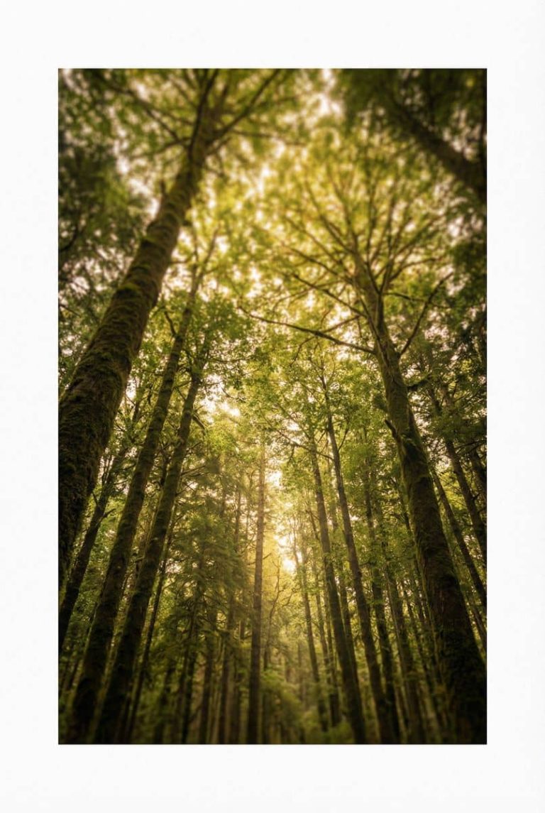
For focus and analytical work, consider nature art in soft blues and greens. The color provides the psychological effect, while the nature imagery adds its own restorative benefits.
For creative energy, art with warmer tones, yellows, oranges, and even touches of red can provide stimulation without overwhelming your entire visual field.
For stress management, calming landscapes, water scenes, or abstract pieces in cool, muted tones can create visual resting points that help regulate your nervous system throughout the day.
The key is being intentional about what colors you’re introducing through your art choices, not just picking pieces because they’re pretty or match your furniture.
Office Wall Color: Creating the Right Palette
Now let’s get practical. How do you actually put this science into practice when choosing colors for your office?
The Base + Accent Approach
The strategy that seems to work best based on both research and practical application is what I call the base plus accent approach.
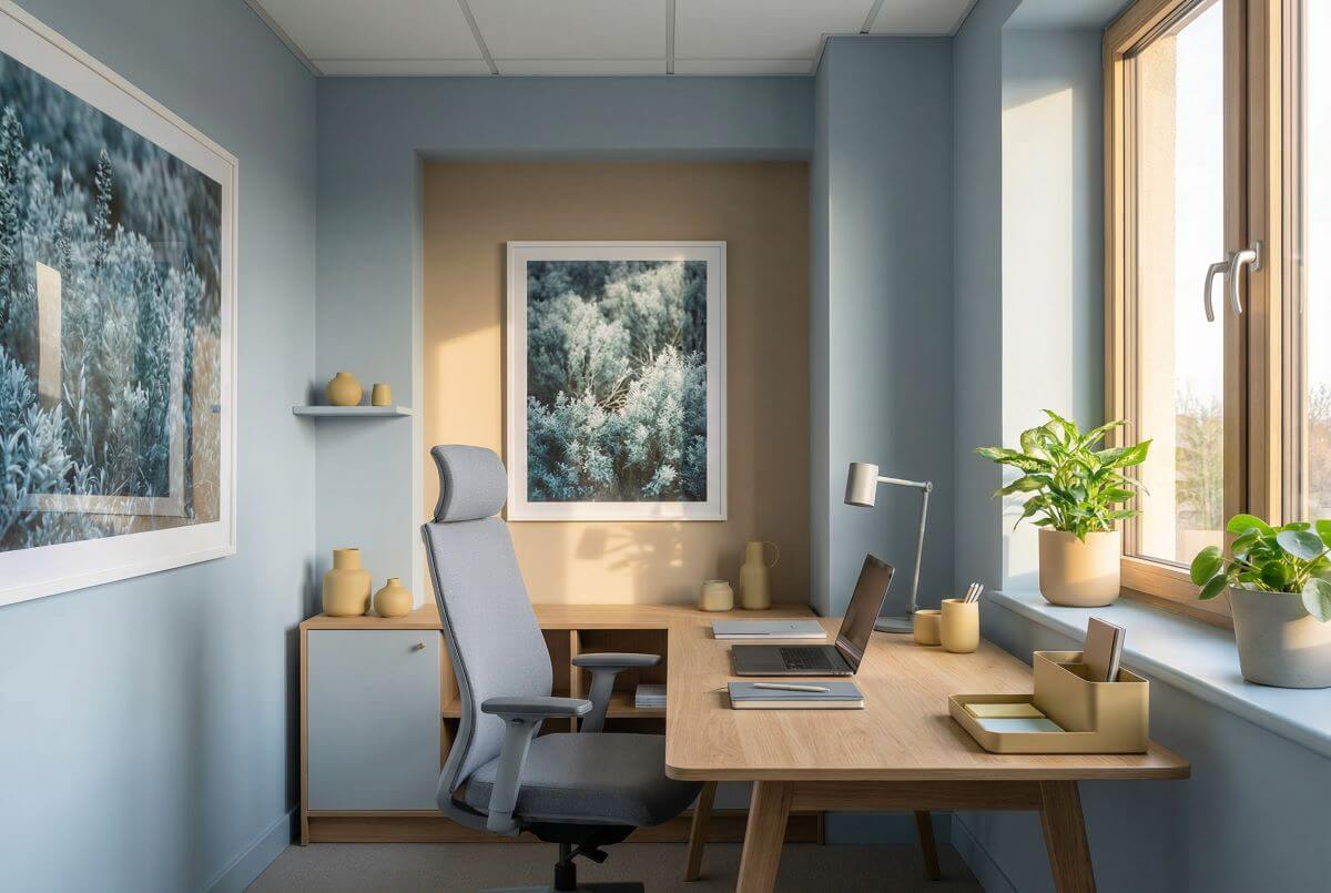
Your base color, covering most of your walls, should be a soft, low saturation blue, blue green, or warm grey beige. These colors provide calm and focus without being boring, and they work for a variety of tasks and people.
Then, you add strategic accents of more intense or energizing colors where you want specific effects. Yellow or orange in collaboration zones. Greens in rest areas. Warmer tones near social spaces.
This gives you the benefits of different colors without the downsides of too much of any one color. It also creates visual interest without overwhelming your space with intense stimulation.
The Role of Lighting
Something crucial that doesn’t get talked about enough: lighting dramatically affects how colors appear and how they make you feel.
The same blue paint that feels calm and productive under natural daylight might feel cold and sterile under harsh fluorescent lighting. Yellows that seem warm and inviting in morning sun can look sickly under certain artificial light.
Always test paint samples under the actual lighting conditions of your space. Look at them at different times of day. Live with test swatches for at least a few days before making final decisions.
Natural light is always best when you can get it. If your office lacks natural light, that becomes another reason to avoid stark whites that can emphasize the artificial quality of the lighting.
The Texture and Finish Factor
This is subtle but matters: the texture and finish of your wall color affects its psychological impact.
Flat, matte finishes absorb light and can feel warmer and softer. Glossy finishes reflect light and can feel more energetic but also potentially more visually intense.
For offices, a slight eggshell or satin finish usually works best. You get some light reflection to keep the space from feeling dead, but not so much that it creates glare or visual busyness.
Office Wall Art Colors: Strategic Color Layering
Let’s talk specifically about how to use wall art to introduce and layer colors in your office environment.
Think of your wall art as your color accent system. Your paint provides the base, your art provides the strategic color variations that support different needs.
For Home Offices with Multiple Functions
If you work from home and do different types of work throughout the day, your art color choices become especially important because they let you have multiple color influences without painting different walls different colors.
Consider having pieces with different dominant colors that you can swap out or focus on depending on what you’re working on. Blue green art for focused work sessions. Something with warmer yellows or oranges visible when you’re doing creative work.
This might sound overly elaborate, but if you’re spending 40+ hours a week in a space, optimizing it for different types of mental work is worth the effort.
The Size and Placement Strategy
Larger pieces have more color impact than smaller ones, obviously. A large canvas in blue will provide more of blue’s focusing, calming effect than a tiny print.
Place your most important color pieces where you naturally look during work. If you look up from your screen at a certain wall, that’s where your most strategically chosen art should go.
Side walls or spaces you see less frequently can feature different colors without competing for influence.
Home Office Wall Art Colors: Putting It All Together
Let me give you some specific, actionable scenarios and recommendations.
Scenario 1: You do primarily analytical, focused work
Base: Soft blue grey on three walls, warm off white on the fourth wall
Art: One large landscape print in muted blues and greens above your desk
Accents: Plants for additional green, warm wood tones in furniture
This creates a calm, focused environment optimized for sustained concentration without being boring or cold.
Scenario 2: You do creative work and need inspiration
Base: Warm grey beige on most walls
Art: Mixed pieces including something with muted yellows or golds, abstract art with interesting but not chaotic forms
Accents: One feature wall in soft, buttery yellow if you want more energy, or keep it neutral and rely on art for color
This provides enough stimulation to spark creativity without overwhelming you or making it hard to focus when you need to.
Scenario 3: Your work is high stress
Base: Soft, grey green or blue green on main walls
Art: Calming nature scenes, water imagery, soft abstracts in cool tones
Accents: Plenty of plants, natural materials, warm lighting
This prioritizes stress reduction and nervous system regulation, which ultimately supports better work even if it’s not the “most productive” color scheme on paper.
Scenario 4: You share office space with others
Base: Neutral warm grey that won’t bother anyone
Art: Different pieces in different areas, allowing people to position themselves near colors that work for them
Accents: Flexible, changeable elements so different people can customize their immediate areas
This respects individual differences while maintaining overall cohesion.
Comparing Color Approaches: What Works Where
Let me break down the research findings into a practical comparison:
| Color | Primary Effect | Best For | Avoid For | Intensity Level | How to Use |
|---|---|---|---|---|---|
| Soft Blue | Calm focus, mental clarity | Analytical work, sustained concentration | Creative brainstorming needing high energy | Low to Medium | Primary wall color, large art pieces |
| Blue Green | Balance, reduced stress | Mixed work types, home offices | Very energetic creative work | Low to Medium | Primary or accent walls, nature art |
| Green | Nature connection, eye comfort | Restoration spaces, long screen time | Detailed proofreading (per research) | Low to Medium | Accent walls, plants, strategic art |
| Yellow | Creativity, optimism | Collaboration zones, creative spaces | All walls, analytical focus work | Medium (muted) | Accent walls, small art pieces |
| Red | Energy, alertness | Social areas, brief high energy tasks | Large spaces, sustained focus | Very Low (accent only) | Small accents, decor elements |
| Orange | Energy, enthusiasm | Creative studios, short bursts | Shared spaces, focus zones | Low to Medium | Feature walls, art accents |
| Warm Grey/Beige | Neutral base, professionalism | Any work type as base color | As only color (too bland alone) | Low | Primary base for accent strategy |
| White | Clean, spacious feeling | High natural light spaces only | Low light spaces, as only color | NA | Trim, ceilings, mixed with color |
Reading this table, notice that the “Intensity Level” column is crucial. For most colors, you want low to medium intensity, which means muted, desaturated versions rather than pure, bright versions.
Also notice that almost no color should be used exclusively. Even the “safe” choices like blue work better when balanced with other elements.
The Individual Difference Factor
Here’s something important that often gets glossed over: people respond to colors differently based on personal associations, cultural background, and individual psychology.
The research I’ve cited gives you general patterns that hold true for most people most of the time. But you might be the exception. You might find that yellow makes you anxious, or that green helps you focus better than blue, or that you actually work great in all white environments.
The science provides a starting point, not a rigid prescription. Use it as a guide, but pay attention to your own responses. If something doesn’t feel right after you’ve given it a fair try, trust that and adjust.
Gender differences show up in some research, with women tending to respond more negatively to bland neutrals and more positively to certain colors than men. Age might matter. Your personal history and associations definitely matter.
This is why I recommend living with color changes for at least a few weeks before judging them. Initial reactions aren’t always reliable. But if after a month you’re not feeling the benefits, don’t force it just because research says it should work.
The Practical Implementation Guide
Let’s talk about how to actually implement these findings in a real world office.
Step 1: Assess Your Needs
What type of work dominates your day? What are your biggest challenges? Is it focus? Energy? Stress? Different problems call for different color solutions.
Step 2: Start with Base Neutrals
Don’t go straight to full walls of intense color. Start with a neutral warm base, maybe a soft grey beige or very light blue grey. This gives you a foundation that works for everyone and everything.
Step 3: Add Strategic Color Through Accents
Use art, feature walls, furniture, and decor to introduce specific colors where you want specific effects. This is lower risk and more flexible than committing to full walls of intense color.
Step 4: Test and Observe
Live with your choices for a few weeks. Pay attention to how you feel, how your work goes, whether your stress levels change. Be willing to adjust based on what you actually experience, not just what you expected.
Step 5: Refine Over Time
Your needs might change. Your work might change. The seasons change how much natural light you get. Be willing to evolve your color strategy as circumstances change.
My Take After Diving Into All This
After spending probably too much time researching office wall colors, here’s my honest conclusion: the science is real but the effects are moderate, and context matters more than most people realize.
Color can genuinely influence your productivity, mood, and stress levels. But it’s not going to transform a dysfunctional workspace into a perfect one, and it’s not going to compensate for poor lighting, bad ergonomics, or a toxic work culture.
That said, why not get it right? If you’re going to have walls and you’re going to paint them some color, you might as well choose colors that support your work rather than hinder it or leave you feeling depressed.
The safest, most research backed approach for most offices is soft blues and blue greens as your base, with strategic accents of warmer or more intense colors where you want specific effects. This works for most people, most work types, and most situations.
But don’t be afraid to adjust based on your specific circumstances and preferences. The goal isn’t to follow a rigid formula. The goal is to create an environment that helps you do your best work while feeling good about being there.
And remember, wall art is your secret weapon here. It lets you introduce color psychology without the commitment and expense of repainting. It gives you flexibility to change as your needs change. And it adds another layer of positive environmental influence through imagery and composition beyond just color.
Your office is where you spend a huge portion of your life. Making it a place that psychologically supports you isn’t frivolous. It’s practical and worthwhile. Color is one tool in making that happen.
Use the science as your guide, but let your experience be your teacher. Trust the research, but trust yourself too. And don’t be afraid to experiment. The worst case scenario is you repaint a wall or swap out some art. The best case scenario is you create a workspace that genuinely helps you work better and feel better.
That’s worth the effort of getting your colors right.